CLIENT
Heijmans Vastgoed
ARCHITECTS
VISUAL ARTIST
LANDSCAPE ARCHITECT
CONSTRUCTION
CLAY PAVERS
Photos: © Peter Cuypers
Spaarndammerhart in Amsterdam honours past tradition and unites architecture, art and nature
Carpet of clay pavers as part of architectural artwork by Martijn Sandberg
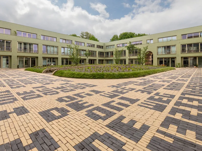
At the beginning of the twentieth century, Spaarndammerbuurt consisted of characteristic urban ensembles from the Amsterdam School period. The neighbourhood is still largely intact but over time it has picked up scars here and there which are slowly healing. The housing complex on the site of the former Spaarndammerschool designed by Korth Tielens Architecten in collaboration with Marcel_Lok Architect is an example of this. The new building is based on the richness of the Amsterdam School tradition which unites architecture, art and nature.
At the heart of the development is the communal green courtyard that is appropriately accessible via gateways leading to the informal routes in the neighbourhood. There are communal gardens in which the existing large trees have been regrouped, creating a vast green outlook for both the residents of the new building and those living in the existing adjoining properties. The project is in line with the pioneering Rainproof policy of the municipality of Amsterdam. Green roofs collect rainwater and there is as little paving as possible within public areas. In the event of heat stress, the abundant greenery and the robust façades cool everything down. The planting has been chosen to provide food for the urban animals to be expected such as small songbirds, bats and insects. In the upstanding eaves and façades, there are nesting boxes for small birds, swifts and bats.
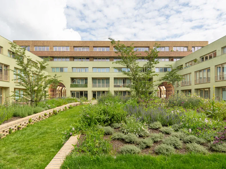
‘De Oude Weg Naar De Nieuwe Tijd’
Martijn Sandberg designed an integrated artwork for the gateways and the paving for the Spaarndammerhart new build project in Spaarndammerbuurt, Amsterdam.
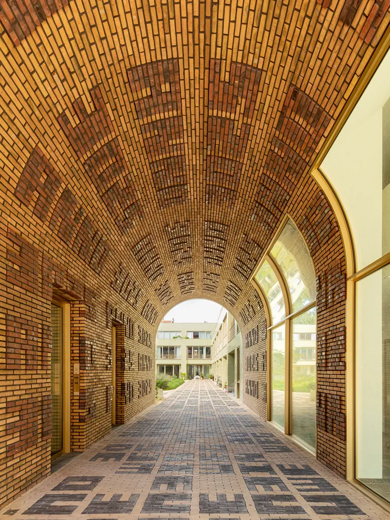
Walking through the gateways on ‘De Oude Weg Naar De Nieuwe Tijd’ (The Old Path To The New Time), a figuration appears before our eyes – like in a vision. In the constantly changing play of light and shadow, brick letters become visible on the wall, the vaulted ceiling and the ground.
It is a figuration consisting of four letters and four numbers – with a different combination of numbers in each gateway – that gives us the access code to a journey through time: ‘Anno 2020’, ‘Anno 1917’ and ‘Anno 3025’. Via the gateways leading to the courtyard, we discover step by step, brick by brick, letter by letter ‘De Oude Weg Naar De Nieuwe Tijd, De Nieuwe Weg Naar De Oude Tijd’ (The Old Path To The New Time, The New Path To The Old Time).
The aim was to develop an artwork that reflected the historical context of the location in which characteristic features of the image carrier also formed part of the design. To design an image where the visual language – ‘the language of the image’ – was directly related to its image carrier and the surrounding urban environment.
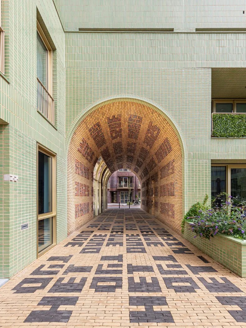
The writing is applied directly to the skin of the architecture like a tattoo: in brick relief in the three gateways, in a contrasting combination of two colours in the brick paving under the arches and in the courtyard, as house numbers in both façades on the street side and in the courtyard. The yellow of the Wasserstrich SeptimA Vanilla clay pavers as the dominant colour gives the whole installation a feeling of freshness and light, while the dark grey SeptimA Titaan creates contrast and forms the graphical aspect.

Martijn Sandberg: “‘You’ll never walk alone’, that’s the feeling I get in the Spaarndammerbuurt neighbourhood. Walking past the Amsterdam School architecture is like a journey through time. My first idea – and they are often the best – for this project came to me while I was walking through the neighbourhood thinking about it in 2016: a text as a brick relief in the masonry of the arches and created underfoot using clay pavers.
There are a lot of underpasses in the neighbourhood, I see them as a transition, a portal leading from one place to another. In these gateways, I wanted bricks – the ‘pixels’ of this particular architectural style – to do the talking, in the form of a phrase that could be read from left to right as well as from right to left. And – just like a gateway – there is no beginning or end. It totally depends which side of the gateway you are standing on.
The design has three gateways and in each one, I captured the time with the word ‘anno’. What would happen if you wrote ‘anno 1917’ on a new building?, I wondered. Or ‘3025’? A year so far in the future clashes with the imagination, while ‘2020’ on the other hand creates an awareness of the present.
The construction of the Spaarndammerhart project took two years. The brickwork for the three archways and the laying of the pavers on the ground was a whole process in itself. Local residents even started dropping by during construction. I also made regular visits myself to check on the work. The postman also came to have a look, even when there were no residents there to deliver to. I heard him muttering to himself: “Well, it fits in perfectly with this neighbourhood.” So the work came to life even before it was completed.”
Martijn Sandberg: “On the ground in the courtyard, six phrases are incorporated in the design which were created after consulting with local residents. They provided phrases that they would like to see reflected in the work. Some actually carried out literature research as a background to this while others wrote poems. Three women acted as representatives of the local residents during the three sessions that we organised in Het Schip. I called them the Three Graces after the goddesses as they breathed life into and inspired the artwork.
During the meetings, I talked about the plan and presented the design drawings, they responded with suggestions from the local residents and topics that were deemed important. The starting point was: a maximum of 30 characters, including spaces. And I didn’t want any truncated phrases, the statements had to fit both figuratively and literally.
Step by step phrases appeared, the letters became pavers. During this process, contributions from the local residents continued to come in and I left that channel open until the flow stopped altogether. The meetings were amazingly interesting. The residents realised that this was more than just another project, it almost felt as if I had invited them to take part in some kind of madness.
After much deliberation, testing and measuring, I chose the final phrases. I consider them to be not only really beautiful and special but also able to stand the test of time. And that is indeed relentless! Each phrase had to be ambiguous and mean something different each time it was read.
Once incorporated in the paved surface of the courtyard, the whole installation became a voyage of discovery. The ultimate figuration therefore literally incorporates traces of the neighbourhood, originating out of the mouths of the local residents or, in the case of a term like ‘workers’ palaces’, from Amsterdam School jargon.
Ultimately, it is the people who walk on it and talk about it who make the work. In the figuration in the gateways and the text on the ground, I am giving you the chorus, the verses you make up yourself. That is what is now captured in the pavers. That is the contribution in brick form.”


Comparable case studies
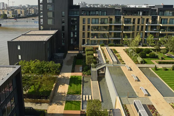
Fulham Riverside is an attractive oasis on the Thames, with its prestigious courtyard garden as its greatest asset
Fulham Riverside is a unique multifunctional building project covering an area of 3.2 hectares. It is located in London on the bank of the Thames, the longest river in England.


